my froyo land
CUP ILLUSTRATIONS
Bridging the gap between product and packaging by visualising My Froyo Land’s flavour diversity through narrative illustration.
Client
Personal Project
Year
Illustration and Branding Design
2026
Scope of work
Digital Mockups
Design information
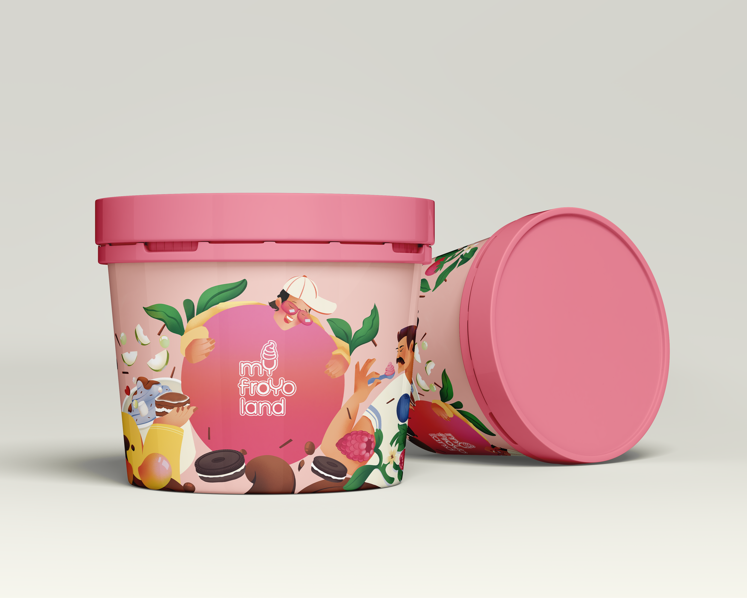
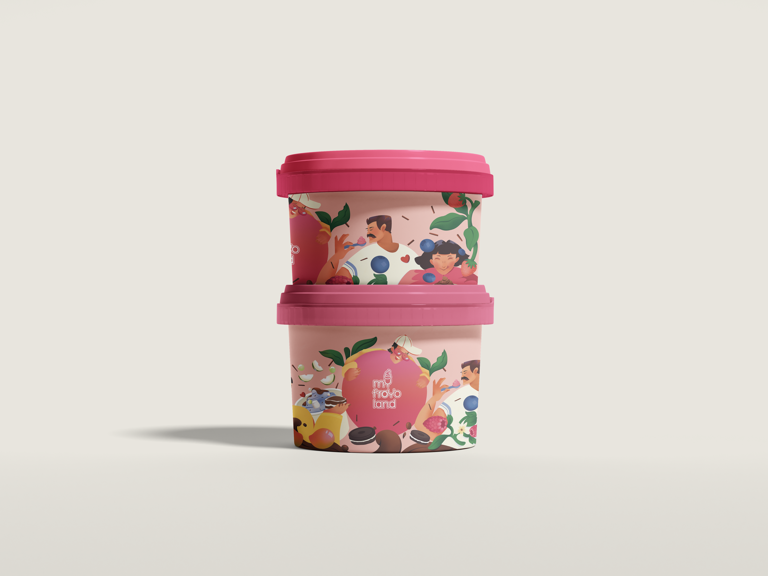
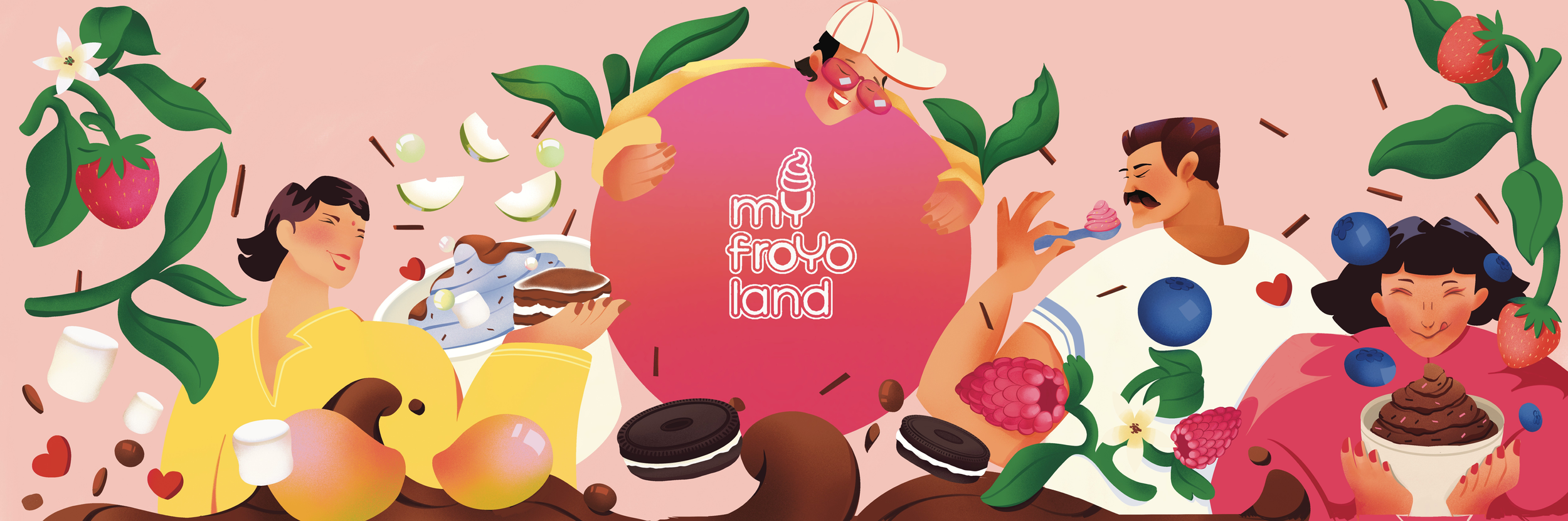
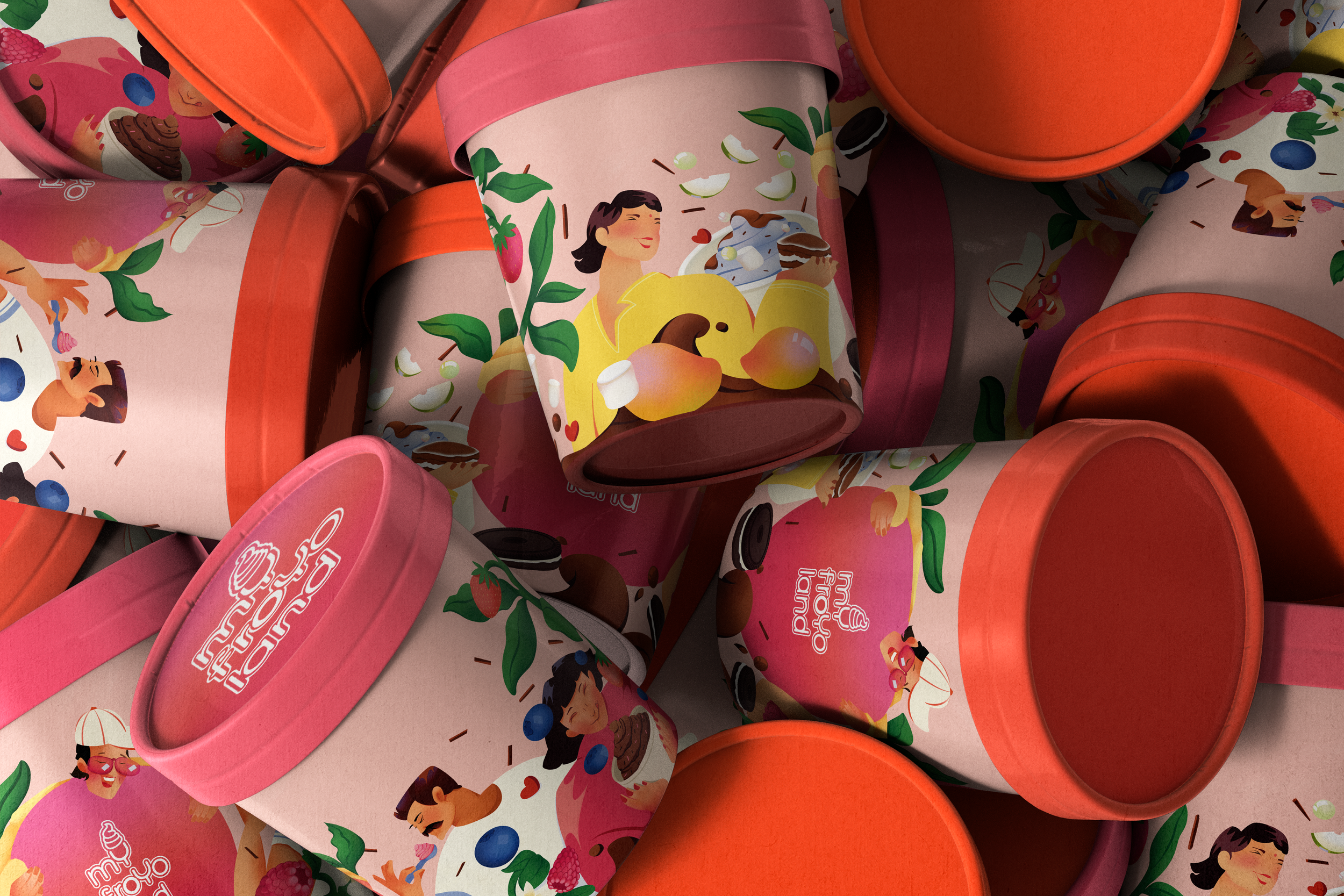
My Froyo Land’s existing cups felt minimal to a fault, logo-led, but not reflective of how vibrant and expressive the actual froyo experience is. The product is playful, indulgent, and highly personal, but the packaging didn’t carry that energy. Being an avid consumer of their froyos, this project started just as an artistic urge to spruce their cups up a bit. The illustration is built by studying their key flavors and translating them into moments rather than just visuals. Indulgent options like the tiramisu flavor is shown as a snapshot of consumption. It’s familiar, current, and taps into its popularity among Gen Z. The healthier side of the menu is represented through a buff male character enjoying Greek yogurt subtly nodding to gym and protein fanatics protein. This contrast helps represents the brands vivacious menu and consumer centric approach. The mango brings warmth and a sense of seasonality, while green apple sorbet highlights their non dairy range . Strawberry and blueberry act as anchors across the design, reinforcing familiarity and tying the composition together since they are store staples. Toppings like sprinkles, rice crispies, popping boba, and marshmallows are scattered throughout, recreating the slightly chaotic, highly customizable nature of building a froyo cup.
The final outcome shifts the packaging from being purely brand-led to experience-led turning the cup into a visual extension of the product itself: colorful, dynamic, and full of choice.
Output