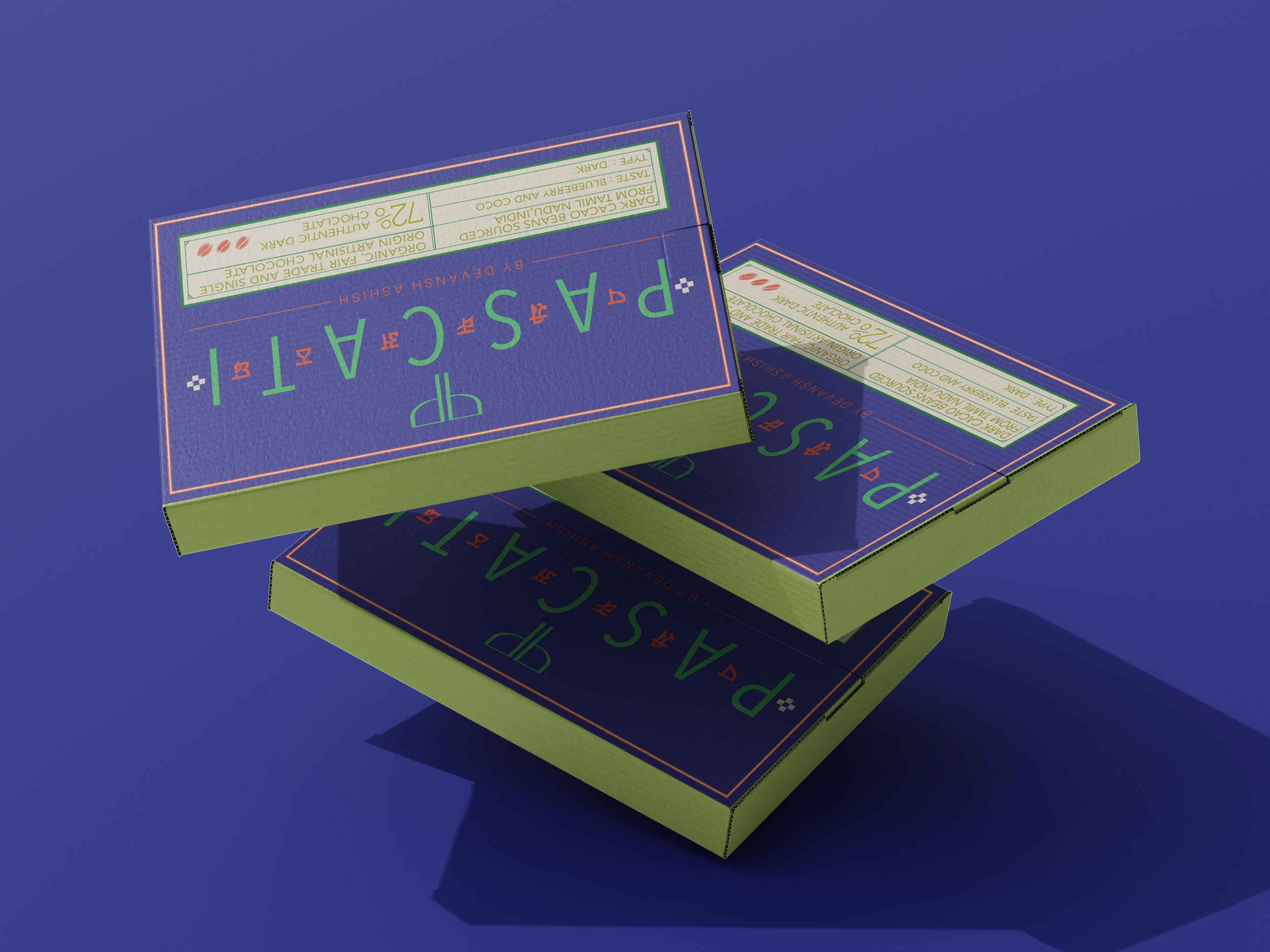
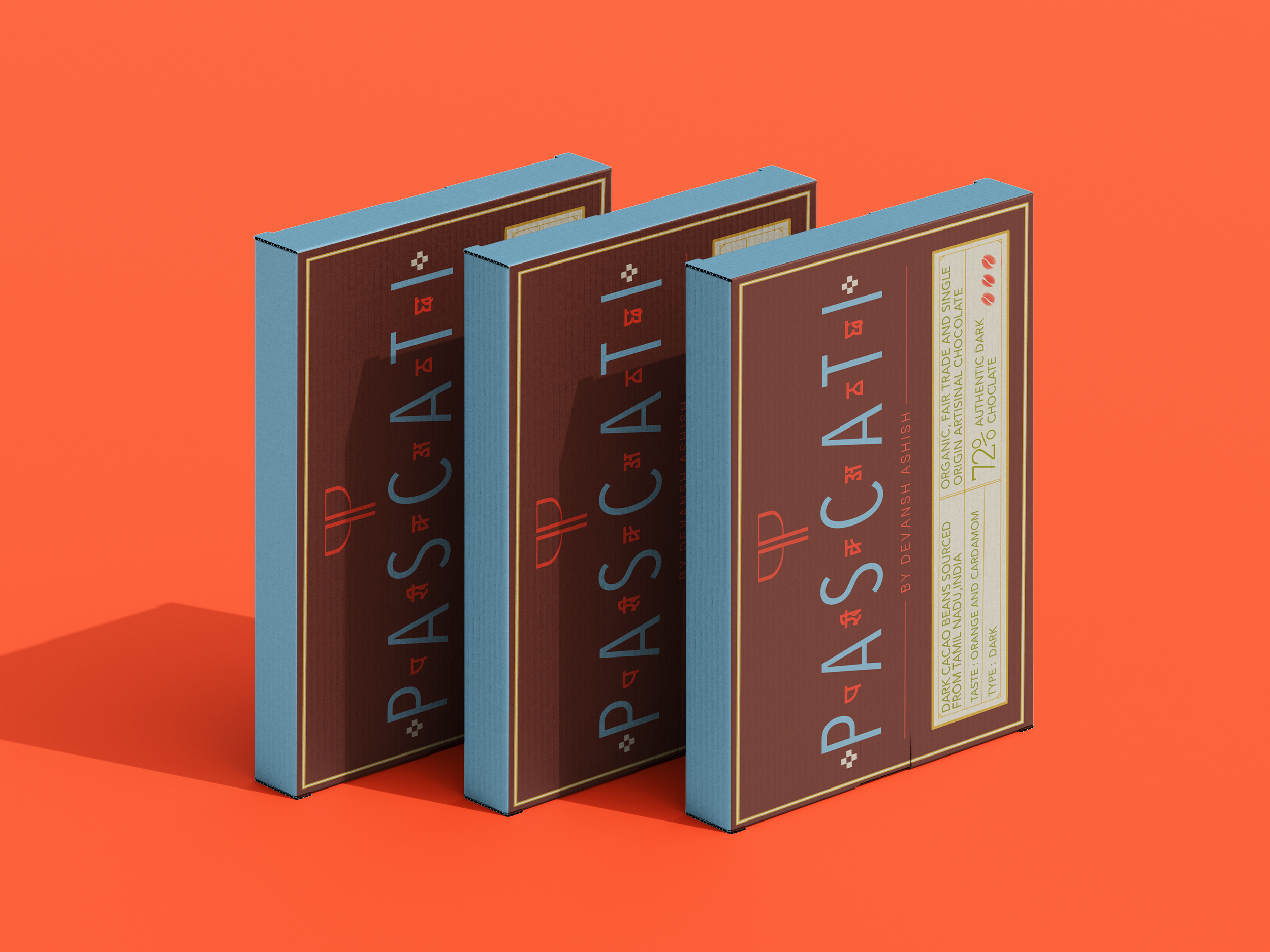
PASCATI RE-IMAGINED
SUSTAINABLE PACKAGING
A user-centered redesign of Pascati Chocolates that balances storytelling, functionality, and shelf impact.
CLIENT
University Project
Packaging Design
SCOPE OF WORK
OUTPUT
2026
YEAR
Digital Mockups
Design Information
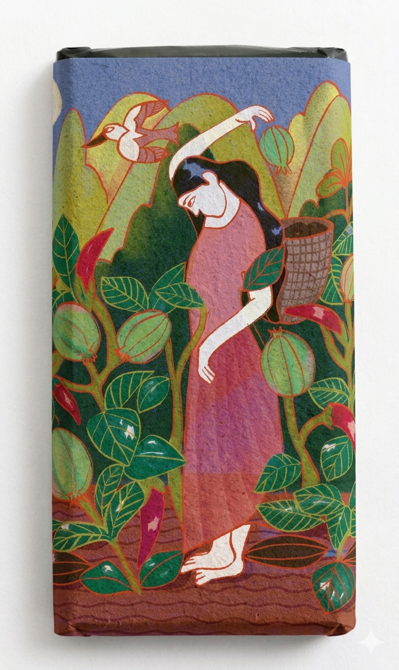
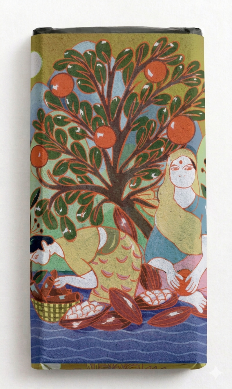
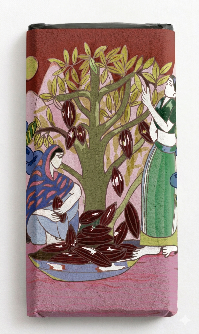
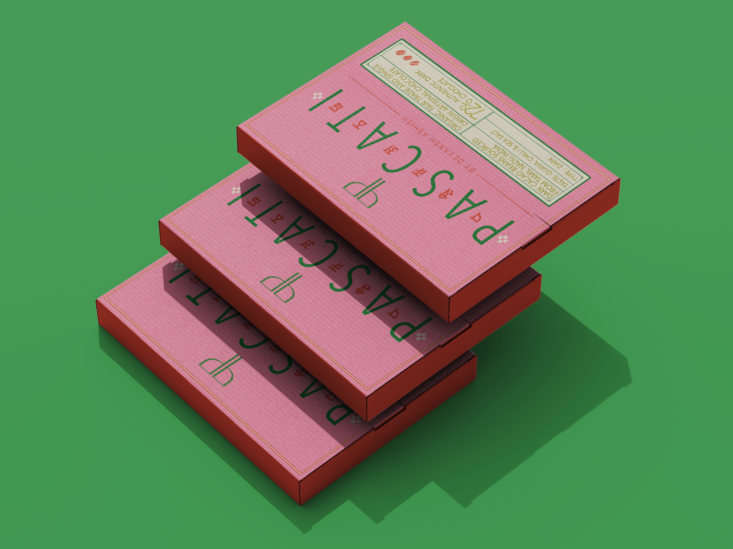
This project reimagines Pascati, India’s first USDA-certified organic chocolate brand, by pivoting from conventional "prestige" luxury toward a vibrant, story-driven identity that embraces the natural energy of its origin. While the premium chocolate sector often relies on muted tones and cold minimalism to signal quality, this redesign utilizes a youthful and sustainable-focused color palette, pairing deep earth tones with electric teals and sun-drenched ambers to reflect the vitality of the ingredients. At the heart of the visual strategy is a shift toward a "human-centric" harvest, moving beyond product-only imagery to feature bespoke illustrations and South Indian motifs that celebrate the symbiotic relationship between the harvesters and the land. By integrating traditional-inspired character styles and folk art elements, the packaging honors the cultural heritage behind the crop rather than just the final product. The physical experience is further elevated through materiality, using grainy, organic-textured paper that provides a tactile, rough-hewn feel reminiscent of raw cacao pods. This heritage-forward narrative transforms each bar into a sensory journey, inviting a new generation of conscious consumers to connect deeply with the origin story and sustainable craftsmanship behind every ingredient.
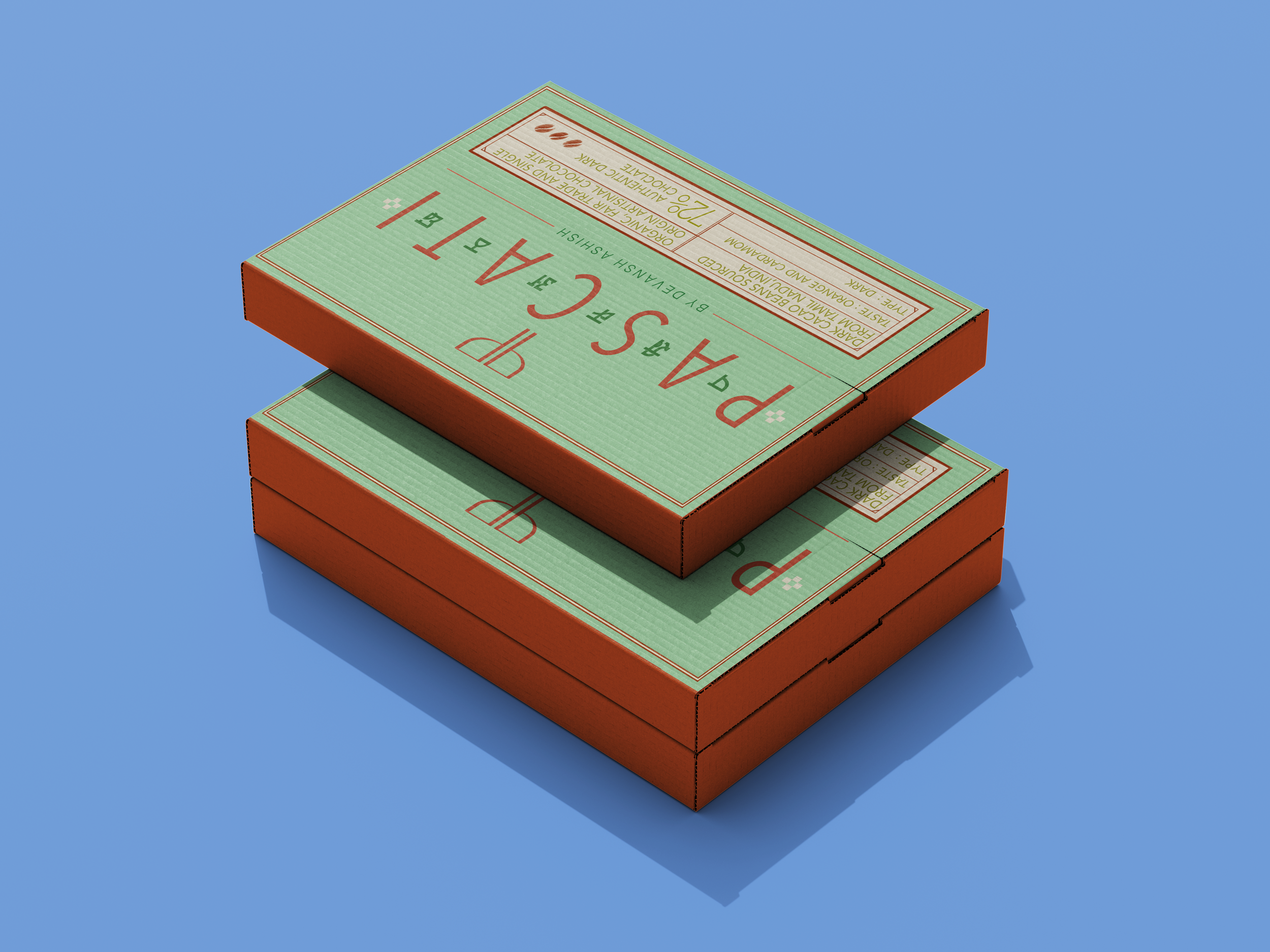
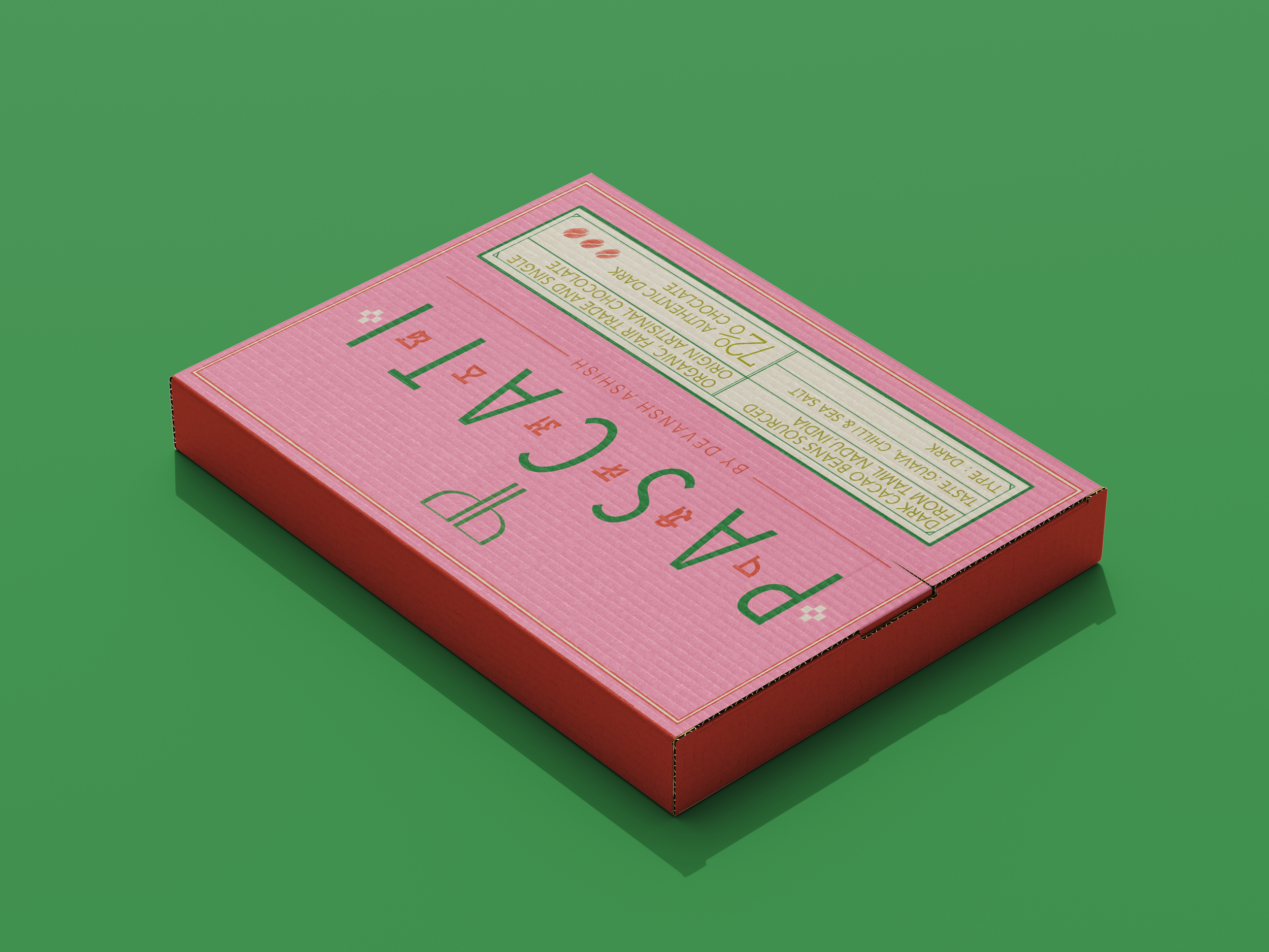
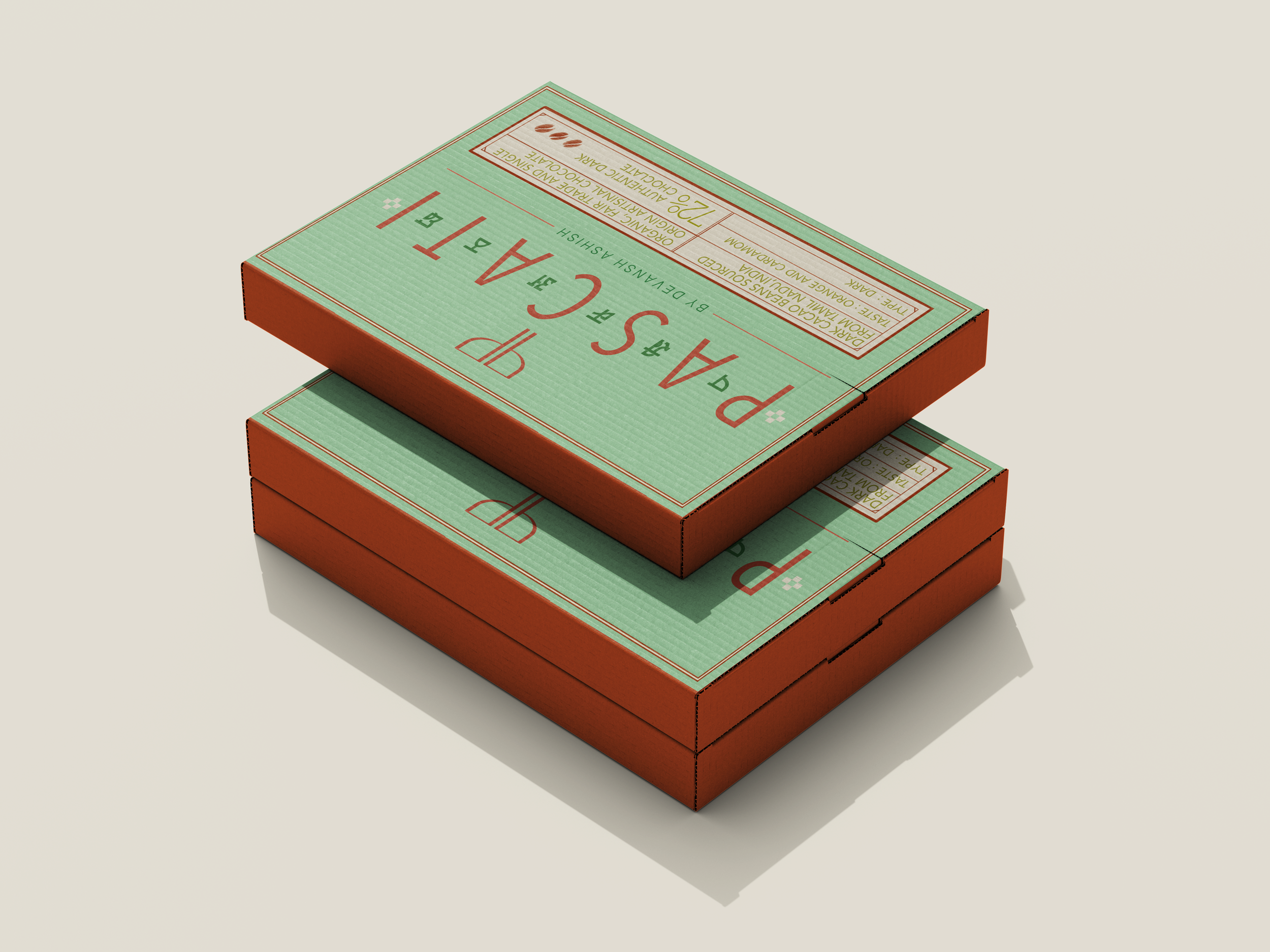
These illustrations, designed individually unique to it each flavor are intentionally curated to be wrapped around the chocolate honoring their honest harvesting practices bar, invoking an unravelling experience of the journey of the chocolate itself before landing upon it. Pascati stands for authenticity and true transparency comes from honest story story telling.